Project name and identifying details have been omitted due to a NDA.
The overview
Timeline
Nov 2024 — Now
Responsibilities
Product Strategy, Research, Prototyping & UX/UI Design
Team
1 PM, 1 UX Designer, 1 UI Designer, 1 Systems Analyst, 2 Devs, 1 QA
The problem
Background
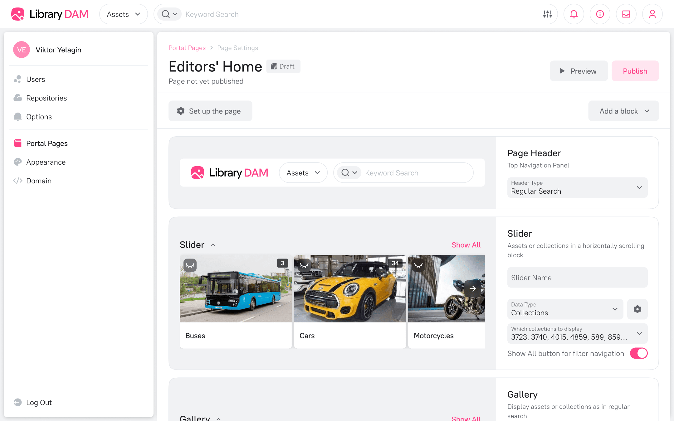
This Enterprise DAM is a system designed for storing and organizing vast amounts of digital content. While it excelled at asset management, its content distribution capabilities were limited. The existing "Homepage" feature was rigid, offering only three fixed blocks that could link to asset collections.
A major client highlighted this gap, stating their teams found it difficult to locate and share materials. This and the fact that most competitors were already addressing this problem with separate portal functionality signaled a critical market need.
Problem statement
Non-technical users and external partners found the core DAM interface overwhelming for simple content discovery. They needed a way to access curated sets of assets in a structured, context-rich environment.
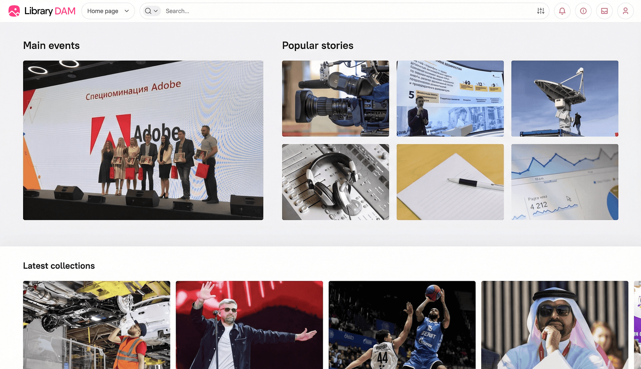
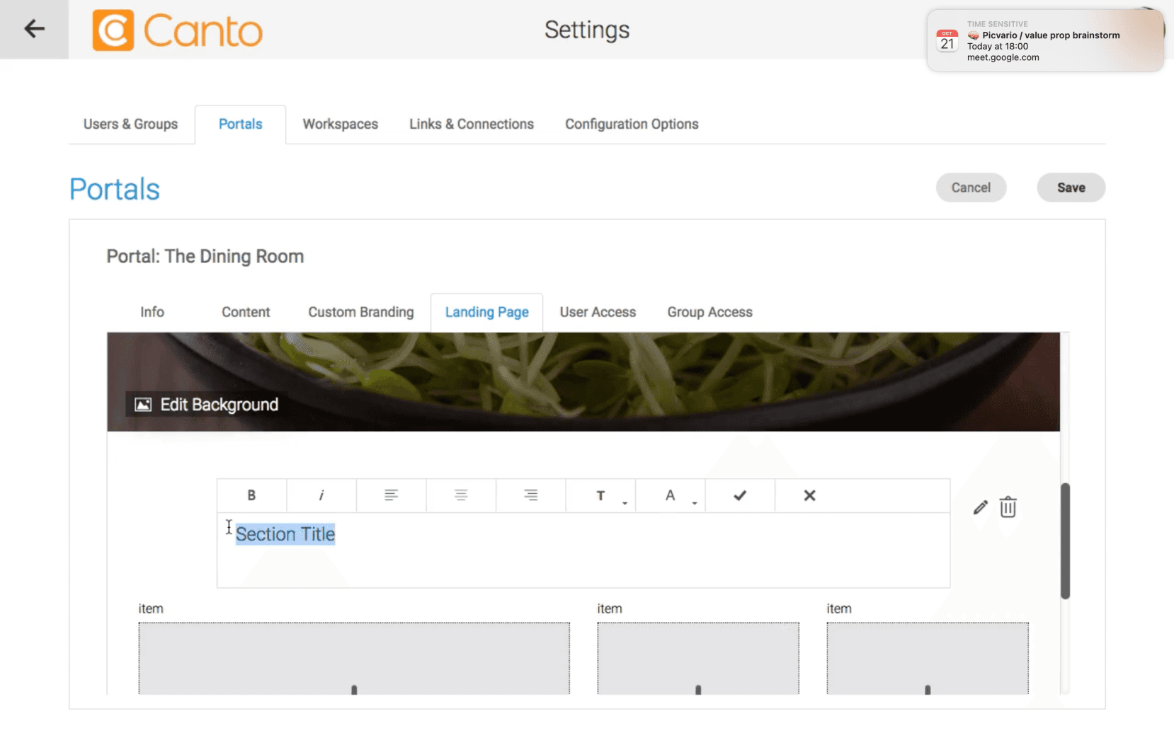
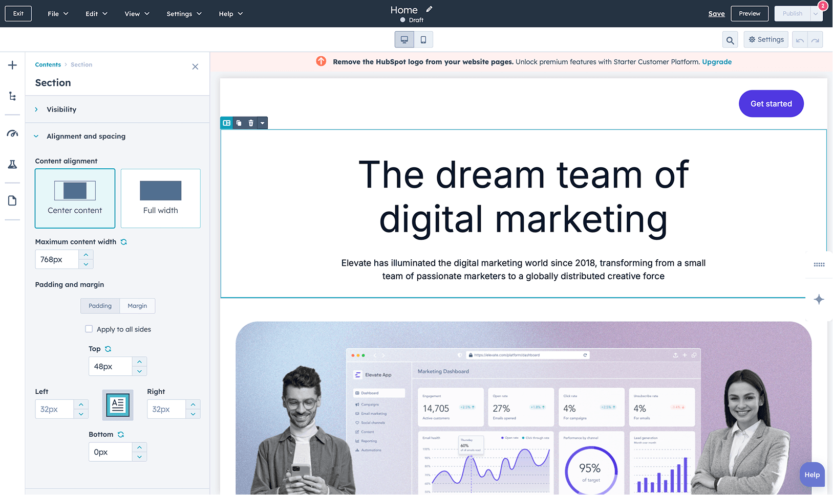
1.1 The old homepage
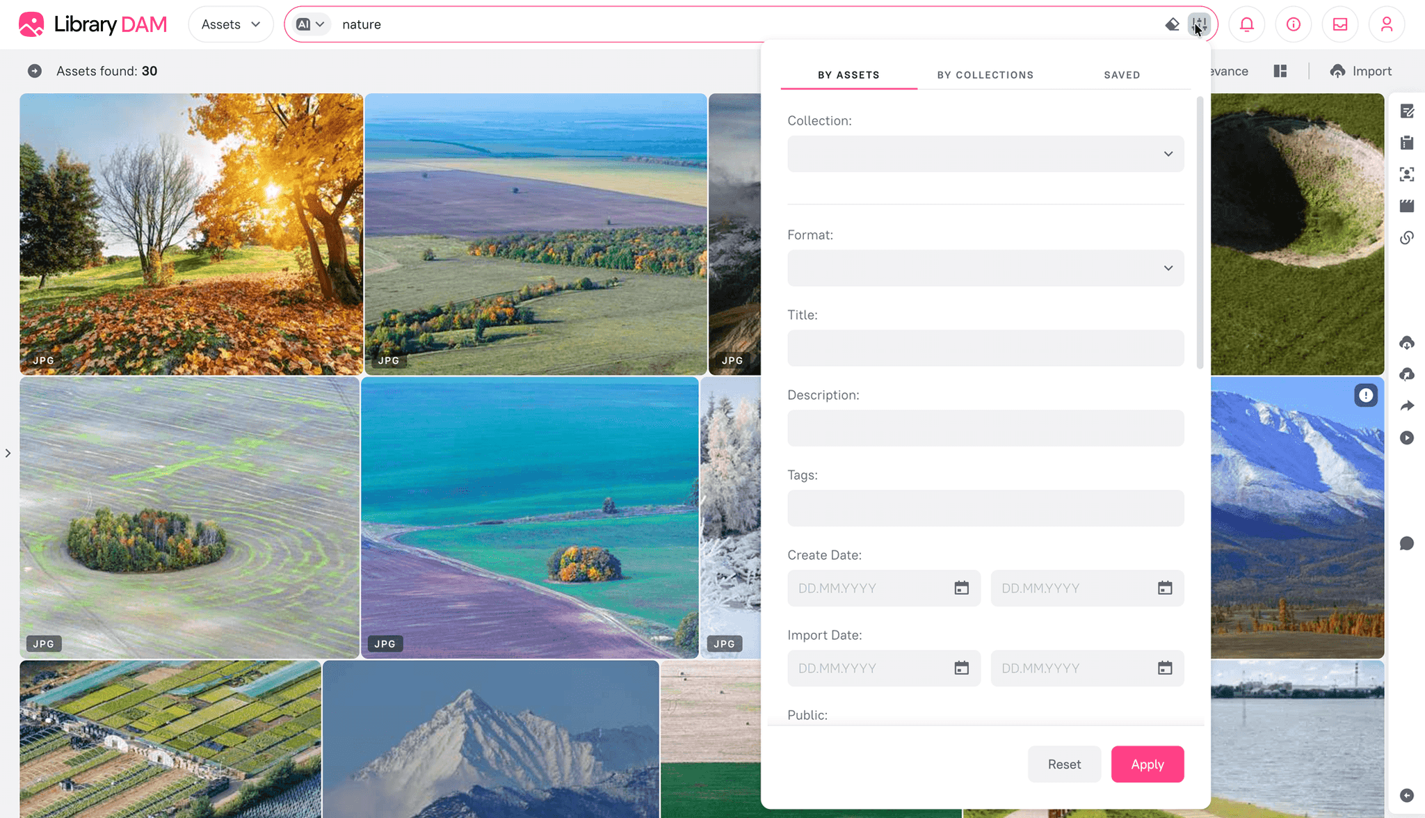
1.2 Assets page
User pain points
Information overload. For a user needing a specific logo or a product presentation, navigating the full system with its advanced filtering was overkill and time-consuming.
Lack of context. The DAM showed assets, but clients needed to present them with descriptions, guidelines, and related materials in a single, cohesive view.
Dependency on editors. External partners and internal teams were dependent on DAM admins and editors to get the right files, creating repetitive manual work.
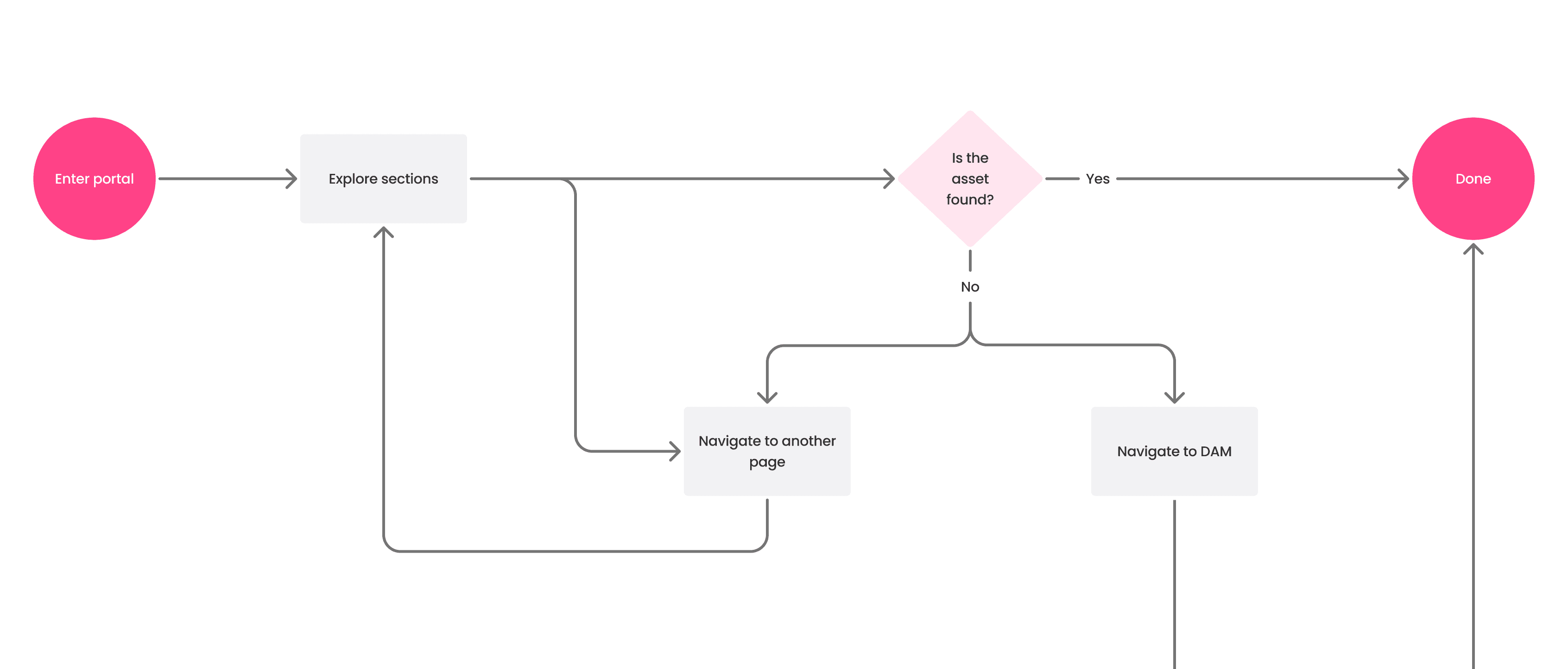
As-is flow
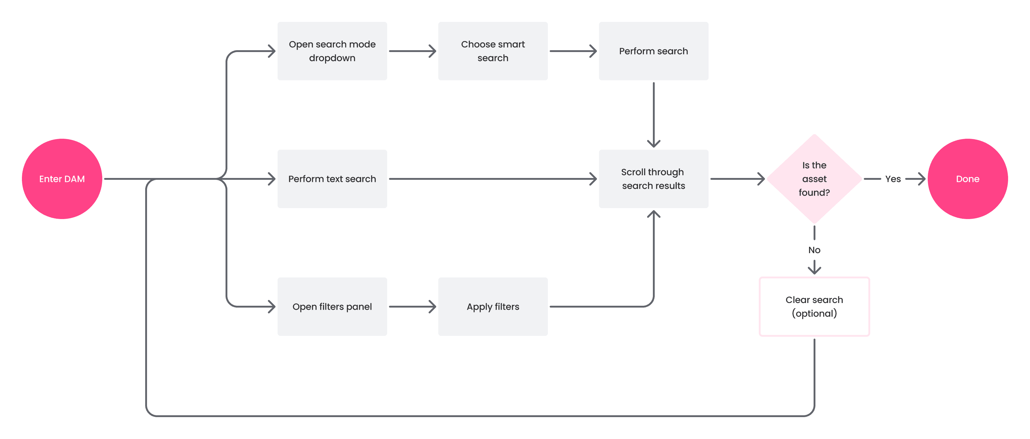
1.3 Old user flow
The goal
Frictionless access
Non-DAM users should be able to get trusted, on-brand files in minutes, without asking an admin or learning advanced filters. Instead of diving into the full DAM, they arrive at a focused, branded hub where curated assets sit next to guidance and materials, and the look & feel stays consistent across pages.
Target flow
2.1 New user flow
What should define the experience
Self-service, zero expertise: clear navigation and obvious next steps; no DAM know-how required.
Context-rich by design: short guidance and related links alongside assets reduce back-and-forth.
Up-to-date & controlled: only approved items are shown; permissions and stable links are respected.
the pivot
Choosing GrapesJS
Initially, the plan was to evolve the existing "Homepage" feature. We proposed adding new block types like tables and carousels, and a visual editor. However, the estimated cost of building this custom solution was high, and the client decided to postpone development until at least 2025.
This setback forced a strategic pivot. A lead front-end developer had previous experience with GrapesJS, an open-source framework for building web editors. We realized we could leverage this experience to deliver a more powerful, cost-effective, and faster solution than a custom build. This decision allowed us to unblock the project and move forward.
2.2 Initial drafts
The Research
Competitive analysis
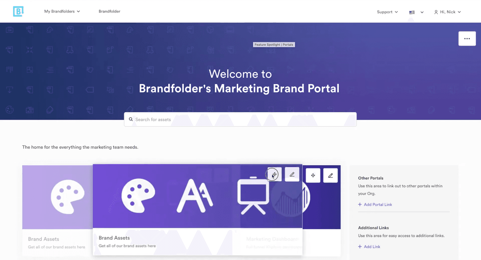
My competitive analysis of leading DAMs like Canto, Bynder, and Brandfolder revealed that their approach to content sharing was powerful but fragmented, creating a clear opportunity for a unified solution.
Key strength: Rich brand portals. Their tools excelled at creating brand-specific pages with dedicated modules for showcasing colors, fonts, and logos.
Key weakness: Fragmented tooling. Users faced a disjointed experience, needing separate products for portals, landing pages, and brand guidelines.


Best-in-class site builders
I studied professional tools (like Webflow, Framer) and simpler ones (Shopify). The key takeaway was the need to balance flexibility with ease of use. We needed to empower users without overwhelming them with complex layout controls.
Real-world brand guidelines
I analyzed public brand guidelines from major companies to identify common patterns and essential content blocks (e.g., color palettes, typography showcases, logo usage rules). This informed our requirements for specialized components.
The Design Approach
Designing for non-technical users
Simplicity through structure
The standard GrapesJS interface is powerful but geared towards developers and designers, with features like a layer panel and fine-grained styling controls. To make it accessible for our target users (marketing managers, brand managers), I established a core architectural principle: simplicity through structure.
I simplified the entire editing experience down to a clear hierarchy: Page → Sections → Columns → Elements
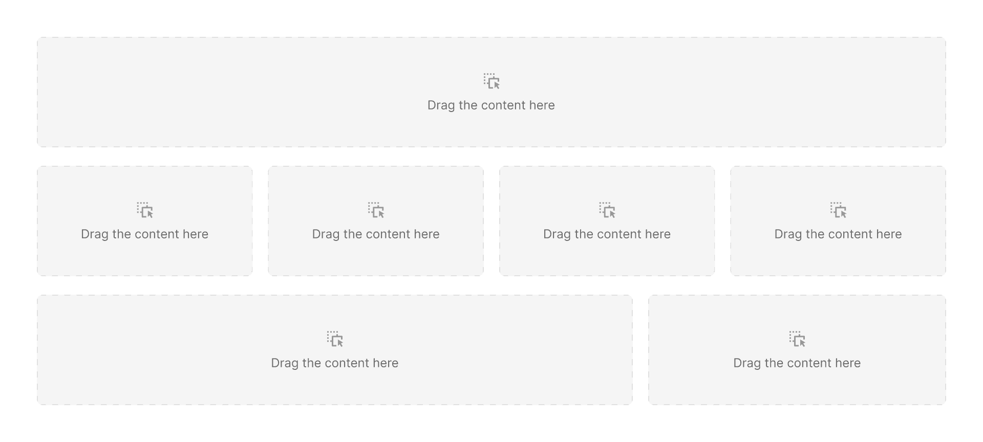
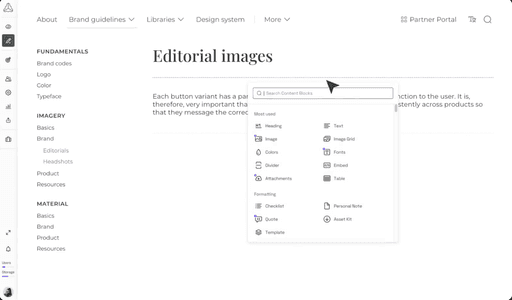
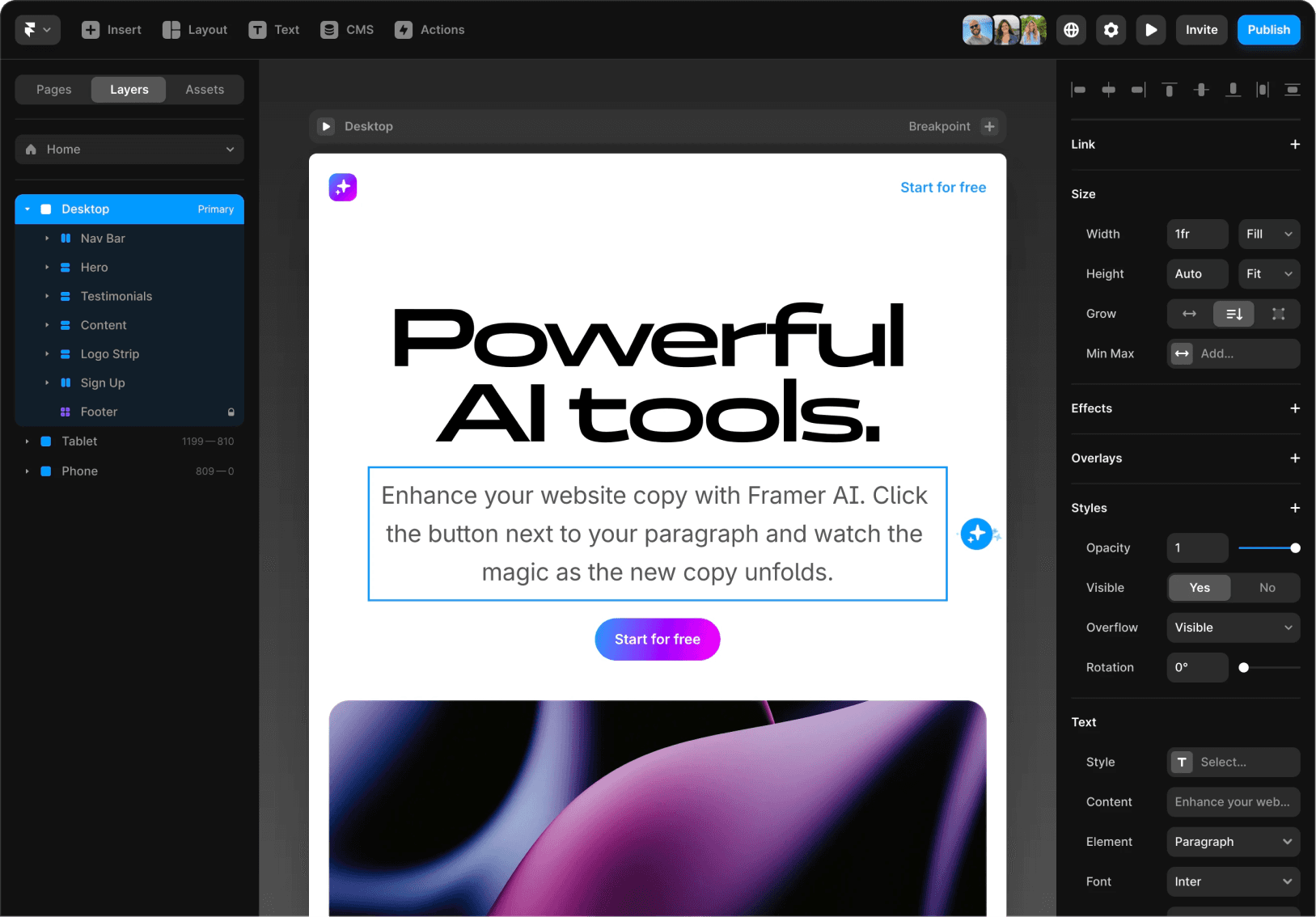
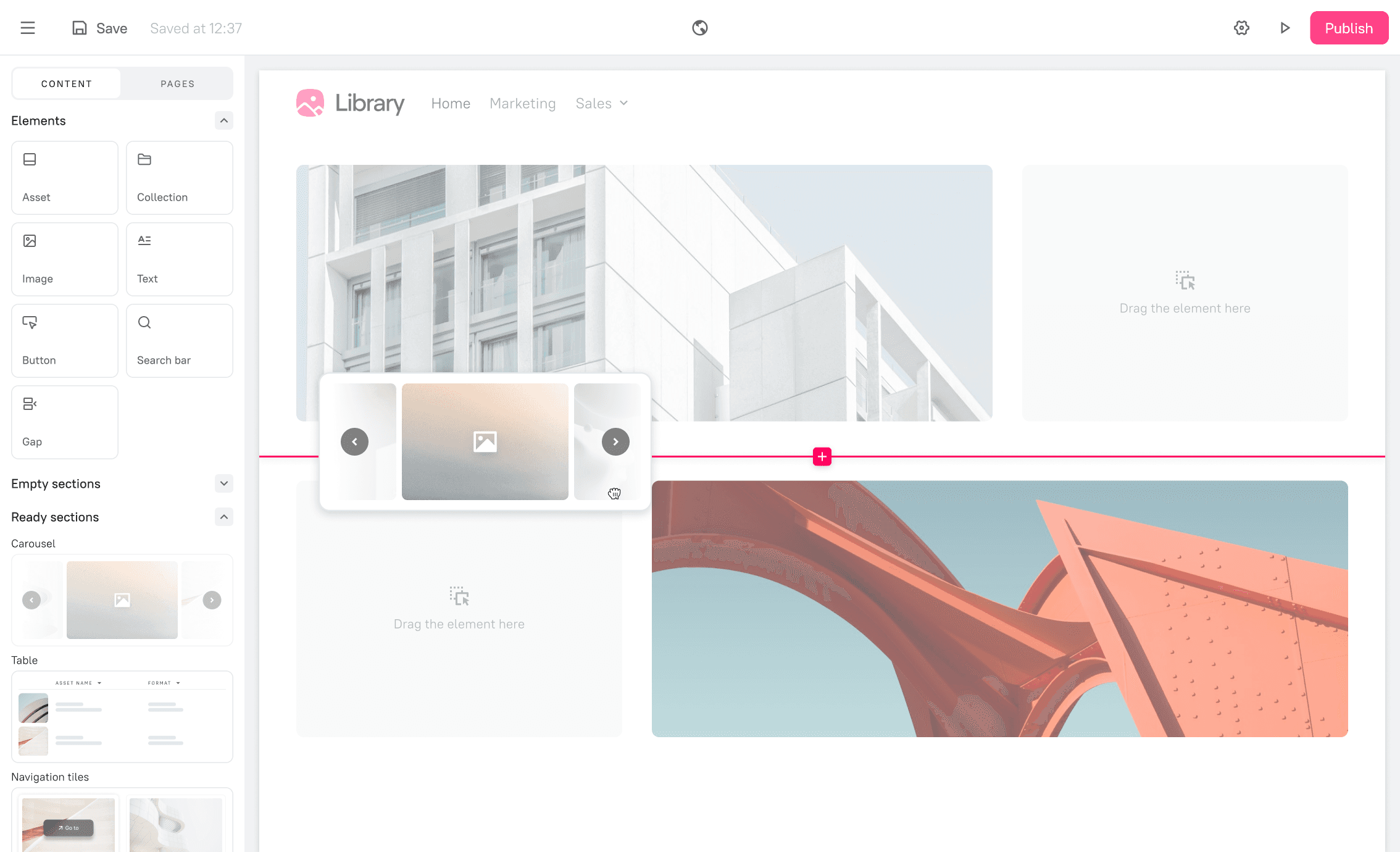
3.1 Sections with columns
Sections & columns. Section is the main building blocks of a page. It can contain up to 4 columns for custom layouts. Each column is a vertical stack.
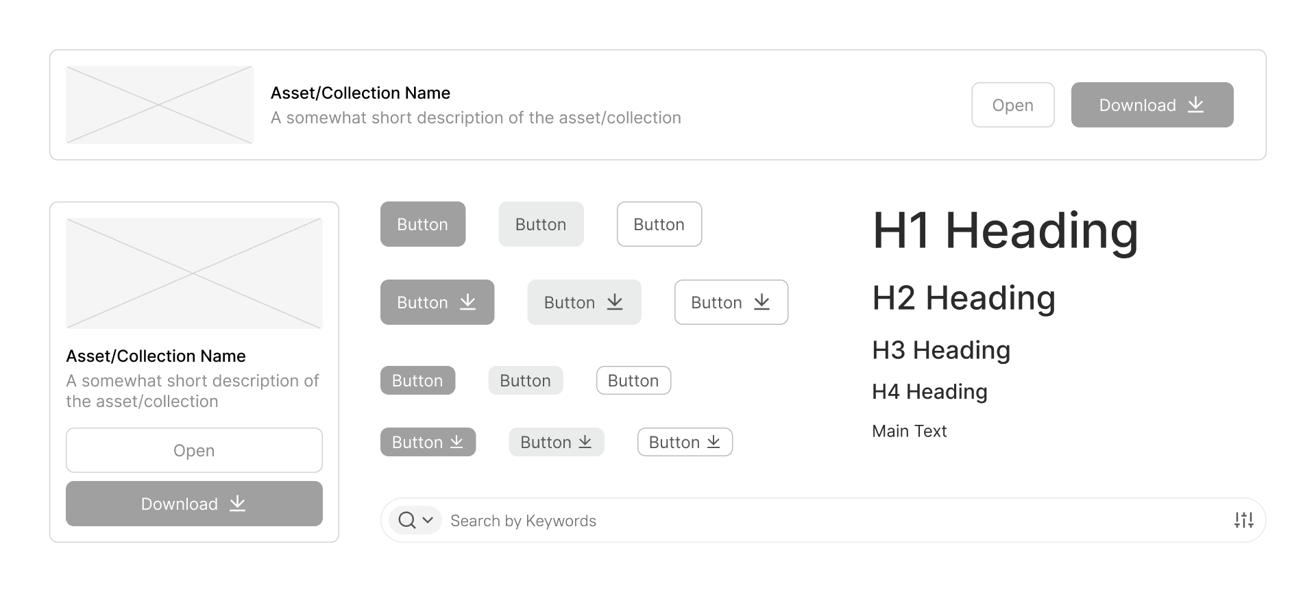
3.2 Elements
Elements. Individual content pieces like text, images, buttons, or DAM assets that are placed inside columns.
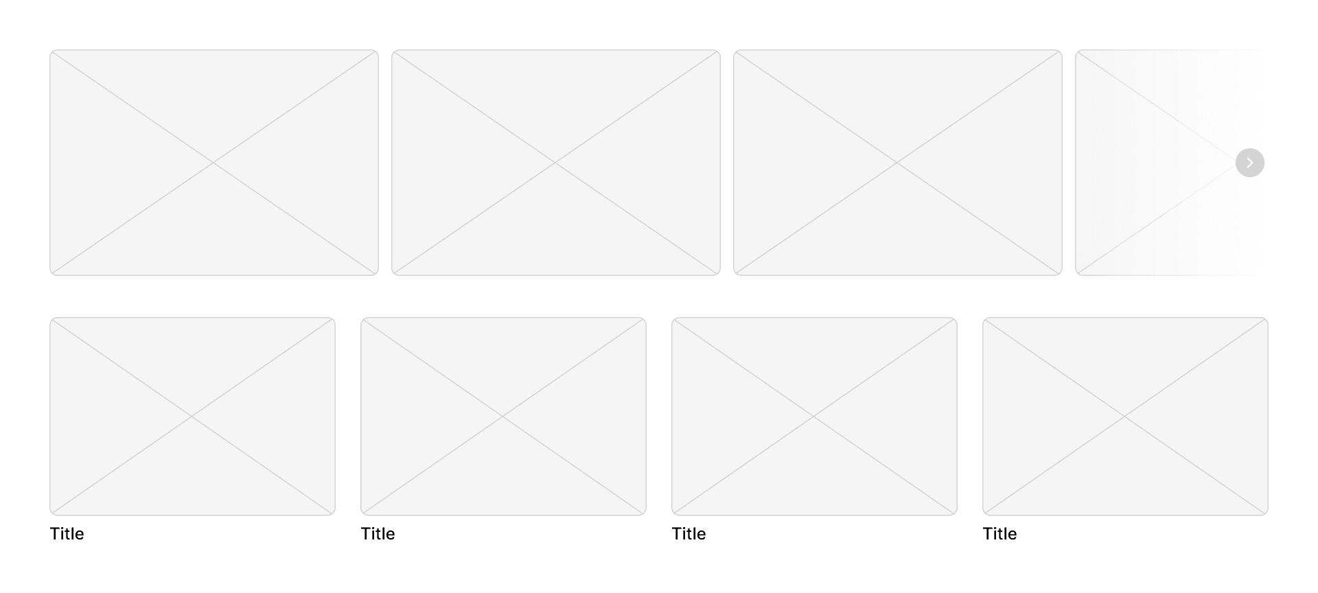
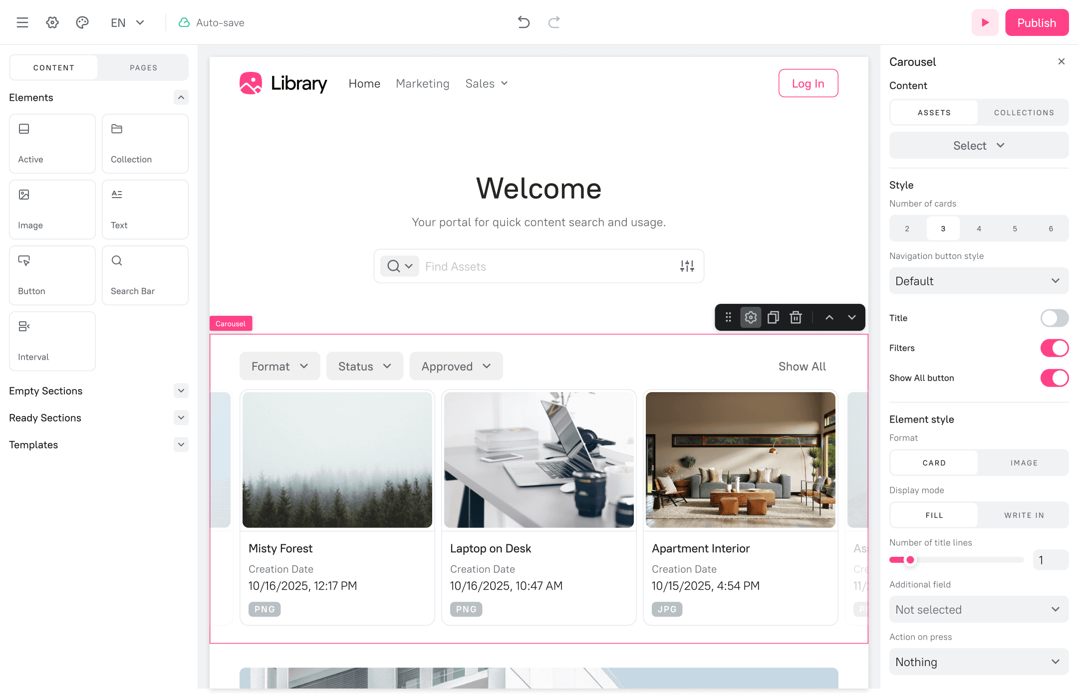
3.3. Carousel and navigation tiles
Ready sections. These are pre-built components with a fixed layout, functioning like configurable widgets. Instead of adding elements freely, you customize their content and appearance through a dedicated settings panel.
ITERATIVE DESIGN
Wireframes & Prototyping
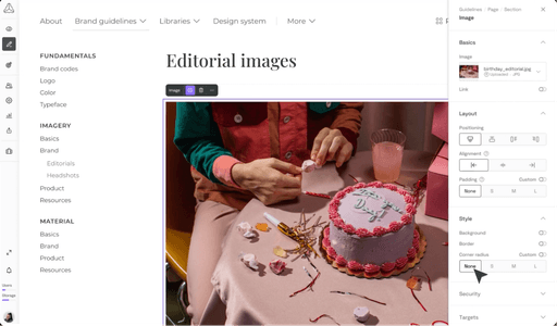
Based on the simplified architecture, I created wireframes for the builder interface. The layout consisted of a left panel for adding content (elements and sections) and a right panel for configuring the properties of a selected object. This is a familiar pattern for users of modern content creation tools.
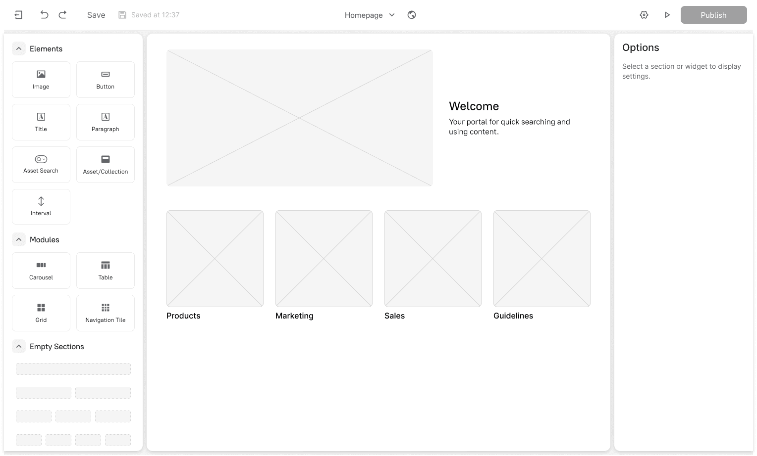
4.1 Portal builder
4.2 Portal design settings
Usability Testing
Before committing to development, I conducted a round of usability testing with 5 internal employees who were not part of the project team. The goal was to validate the core workflows and identify major usability issues early.
Key findings
Right panel blindness. Users often didn't notice the right-hand settings panel and were unsure how to customize elements.
Iteration: I changed the right panel to be collapsed by default. It now opens automatically when an element is selected, drawing the user's attention directly to the available settings.
Confusion between "Modules" and "Empty sections". The distinction wasn't clear in the left panel.
Iteration: I renamed "Modules" to "Ready sections" to better communicate their purpose.
Inline editing. Some users tried to click on inner parts of "Ready sections" to edit them, but the whole components are editable through the right panel.
Iteration: A gear icon was added to the context menu for the selected element as an additional entry point.
final designs
The solution
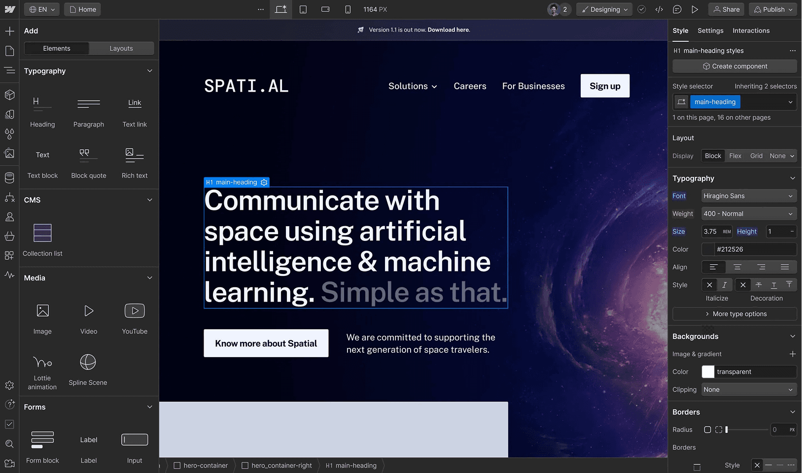
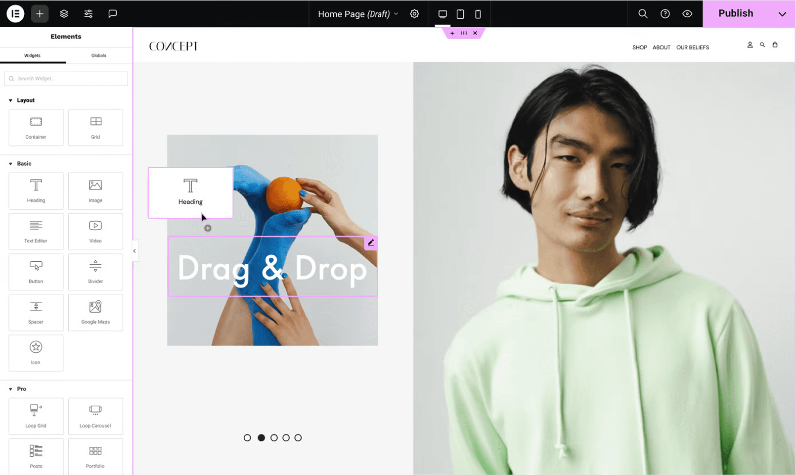
Intuitive drag-and-drop editor
The core of the experience is a clean canvas where users can drag elements from the left panel to build their page. This visual way of working allows users to see their changes in real-time and makes page creation fast and enjoyable.
5.1 Drag&drop
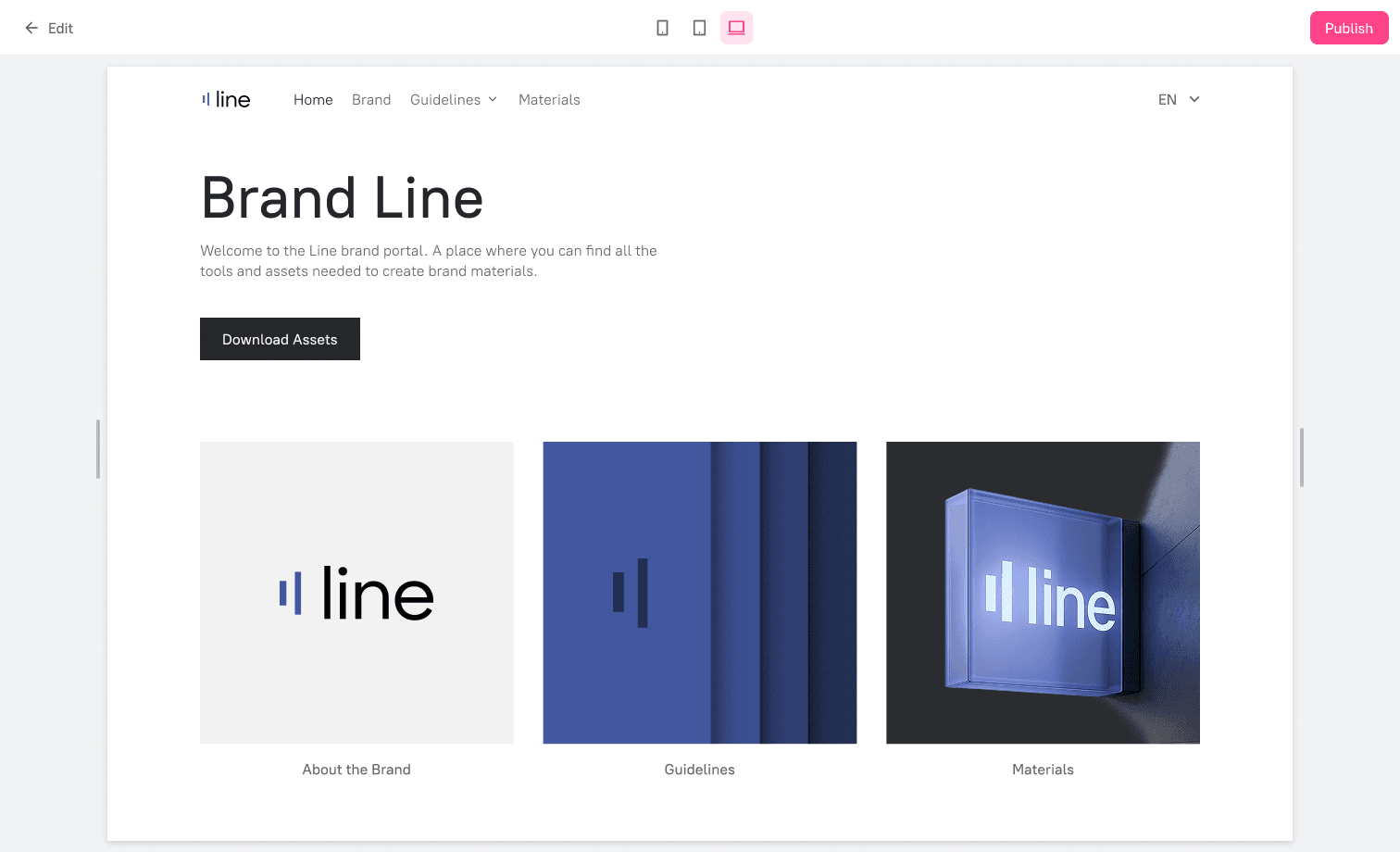
5.2 Portal preview
DAM-connected components

5.3. "Content table" section
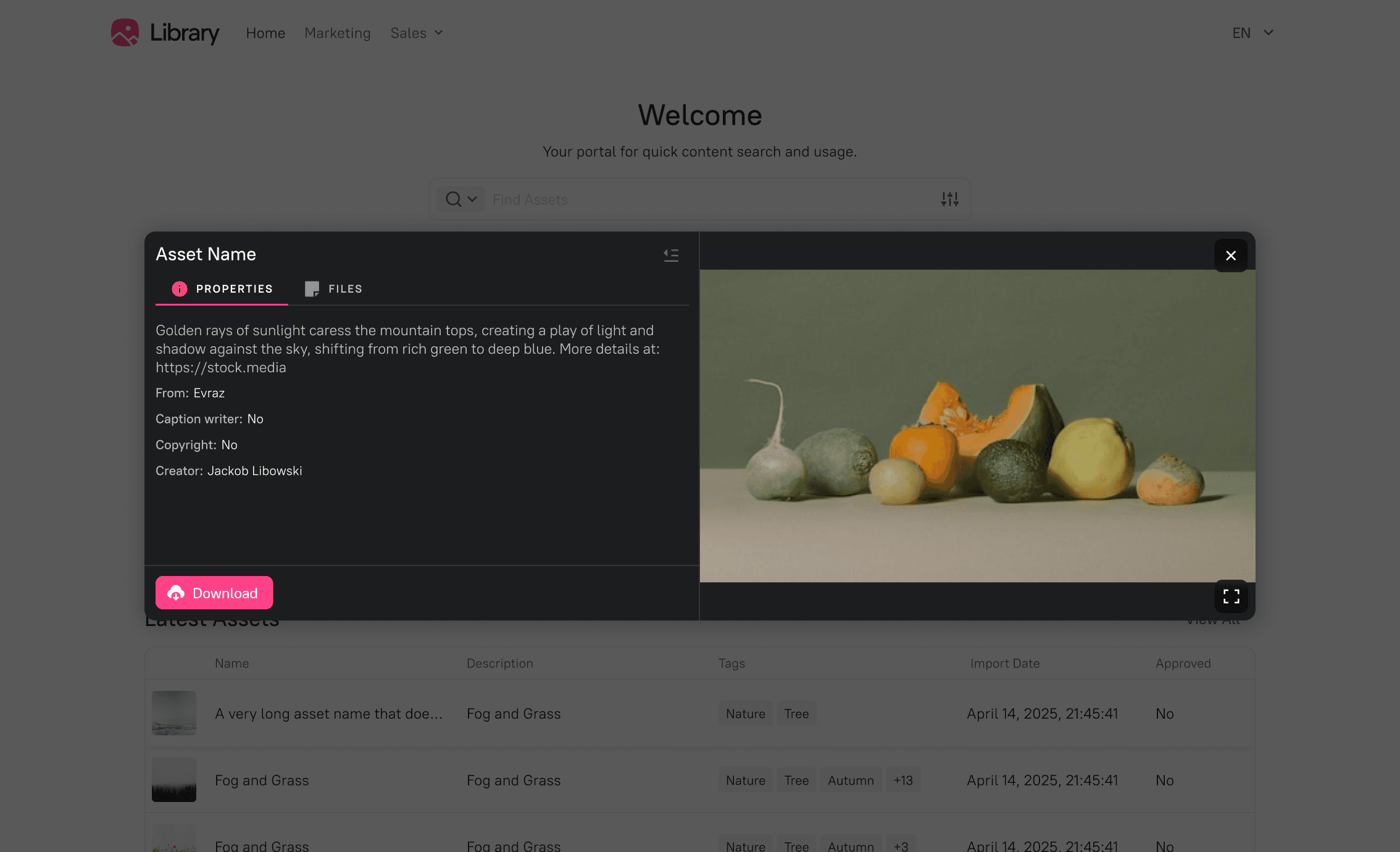
5.4 Asset preview
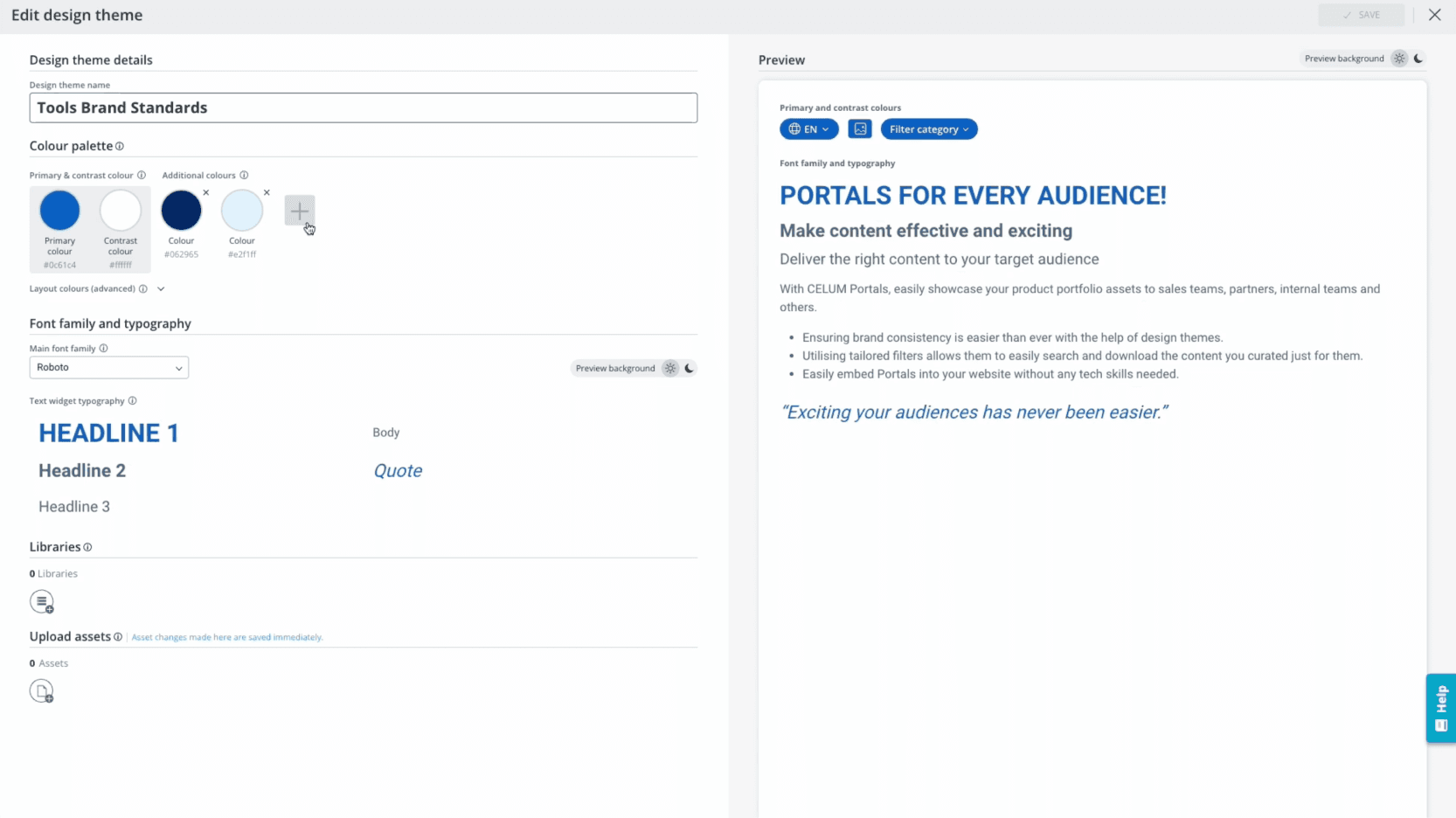
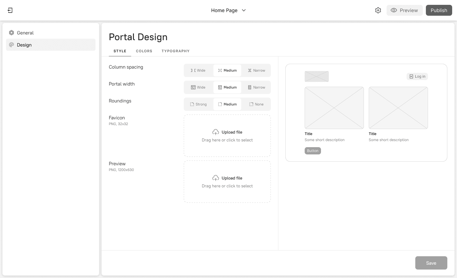
Global design settings
To ensure brand consistency across a portal, I designed a global "Design" panel. Here, users can define colors, typography, and spacing in one place. These settings are applied to all elements, allowing for quick brand updates and a cohesive look.
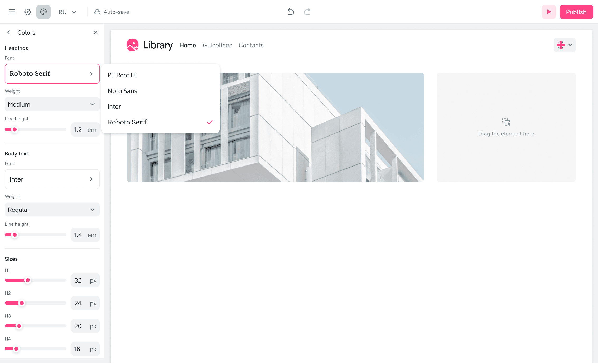
5.5 Typography settings
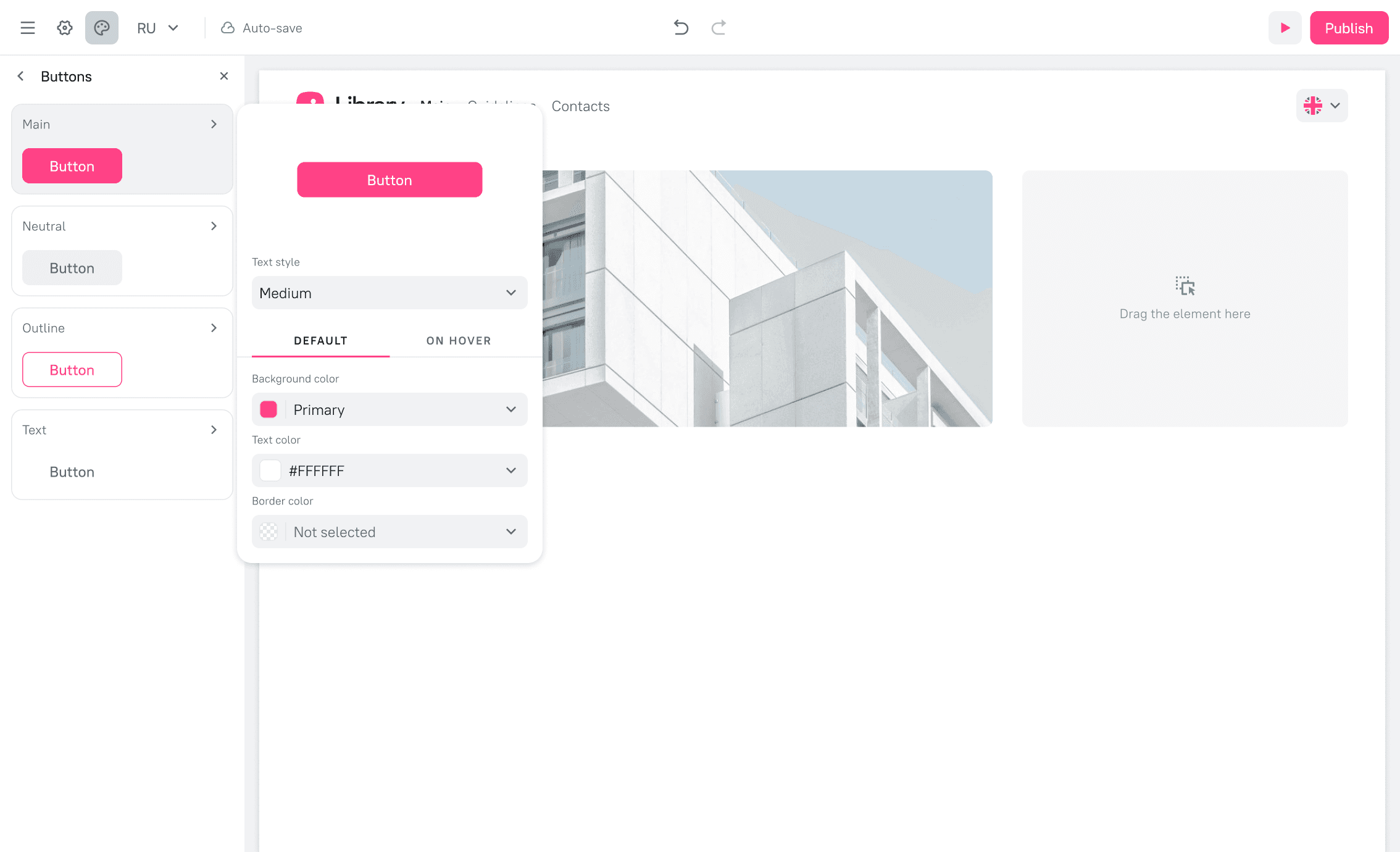
5.6 Button settings
The impact
Measuring success
Key metrics
Key upsell driver for new business. Content Portals became a key upsell driver in new deals, leading to a 20% lift in average contract value when the feature was included.
Successful adoption by existing clients. The feature also proved valuable to our established customer base, creating new upsell opportunities as several existing enterprise clients purchased the add-on post-launch.
Key takeways
The power of pivoting. Embracing an open-source solution (GrapesJS) allowed us to deliver more value, faster and more affordably. It taught me the importance of being adaptable and exploring technical constraints as creative opportunities.
Simplicity is a feature. The most important design work for a complex site builder was not adding features, but making the tool accessible to its intended audience by thoughtfully abstracting away the complexity of layers and code.
Test early, test often. The early round of internal usability testing was invaluable. It allowed us to fix fundamental interaction issues with minimal development cost, leading to a much smoother launch.
Next steps
Based on post-launch feedback from our MVP, we have a clear roadmap for improving Content Portals, including:
1
Advanced SEO settings. Adding controls for page titles, meta descriptions, and social previews.
2
More flexible backgrounds. Allowing gradient and pattern backgrounds for sections.
3
Enhanced image controls. Providing more granular control over image sizing and fitting within containers.